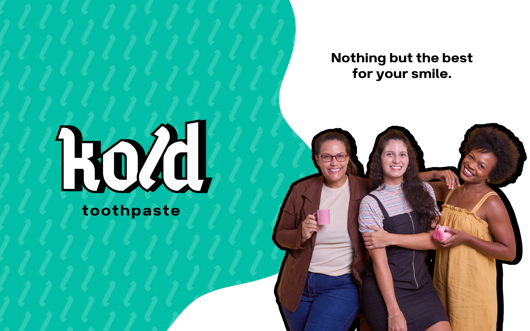
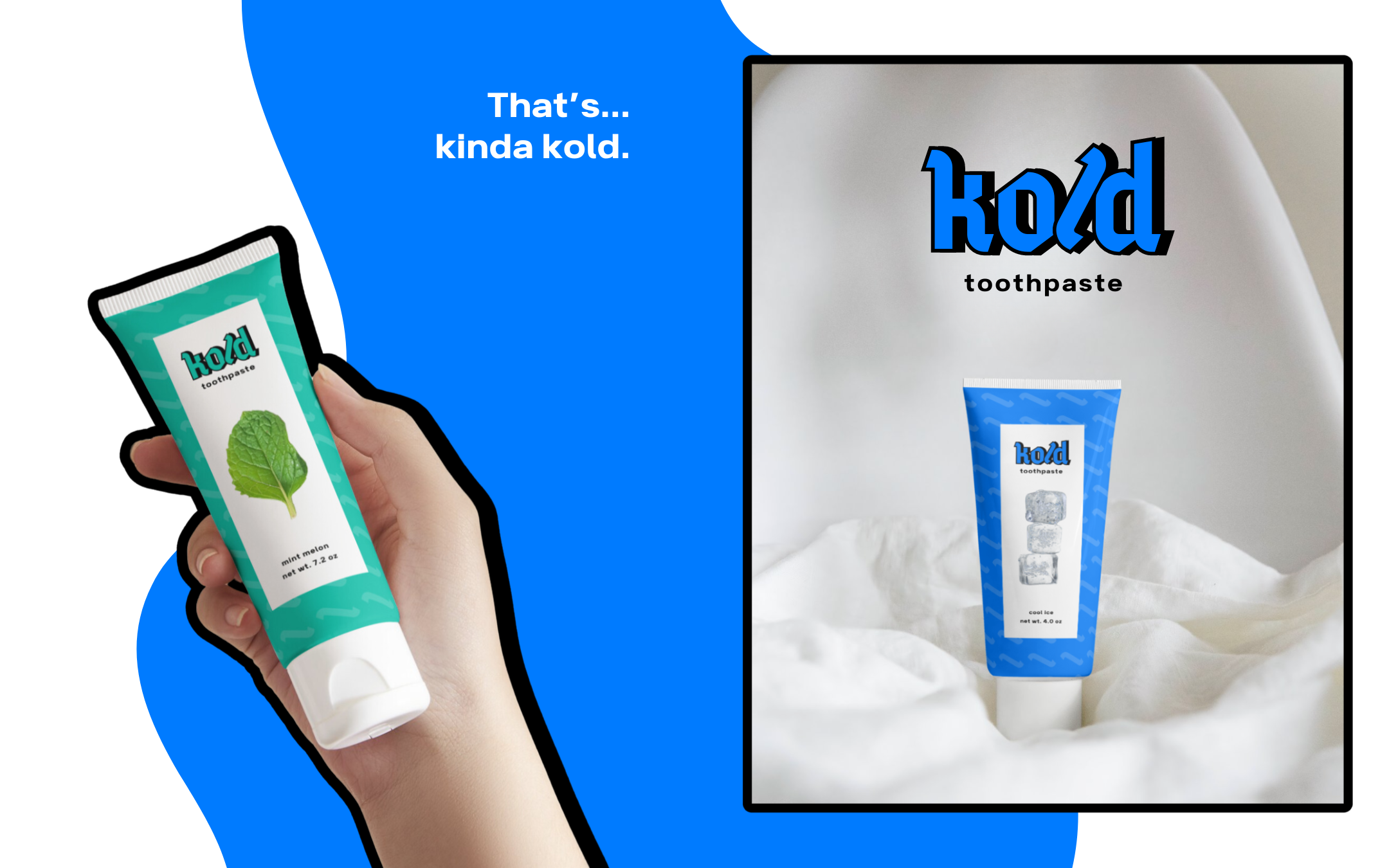
BRIEF kold toothpaste is a refreshing, cool, and minty toothpaste campany targeting young professionals and health-conscious individuals who value oral hygiene and want a revitalizing experience every morning.
OBJECTIVES ✸ Design a logo and packaging that conveys freshness, coolness, and effectiveness. ✸ Create social media assets that align with the brand’s image.
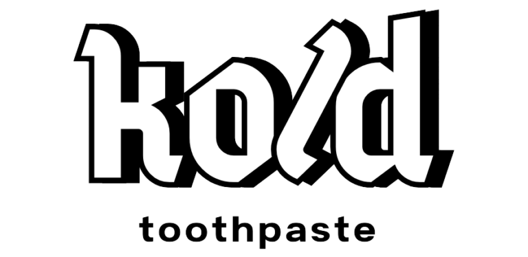
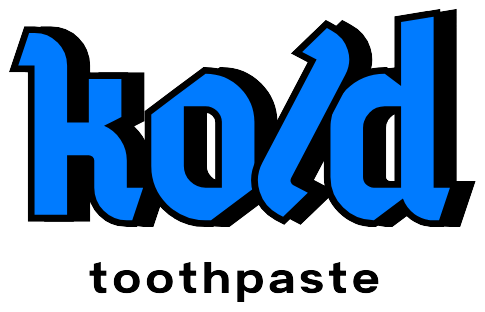
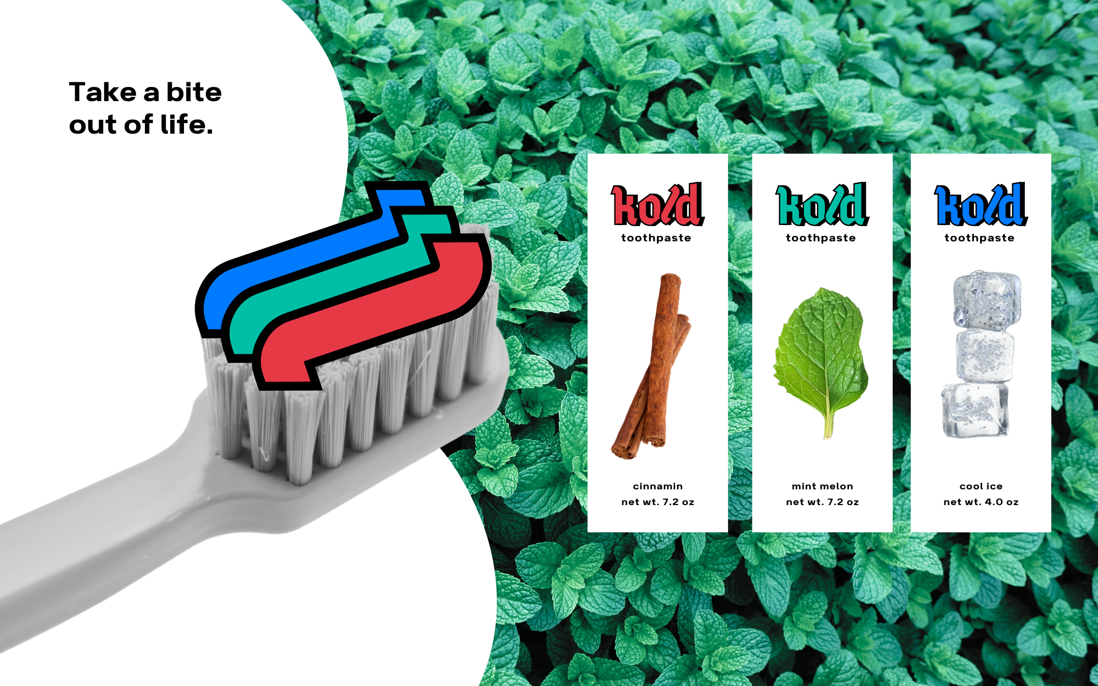
LOGO DESIGN
✸ Bold typography with a retro vibe makes the logo memorable and gives it a strong, playful presence, appealing to younger audiences.
✸ The blue color effectively conveys freshness, coolness, and cleanliness, while the black shadow adds depth and dimension.
✸ The contrast between the bold “KOLD” and simple “toothpaste” creates balance, keeping the focus on the brand name without overwhelming the design.
✸ The “l” as a logomark effectively doubles as a representation of the toothpaste itself, adding a playful and symbolic touch to the design.