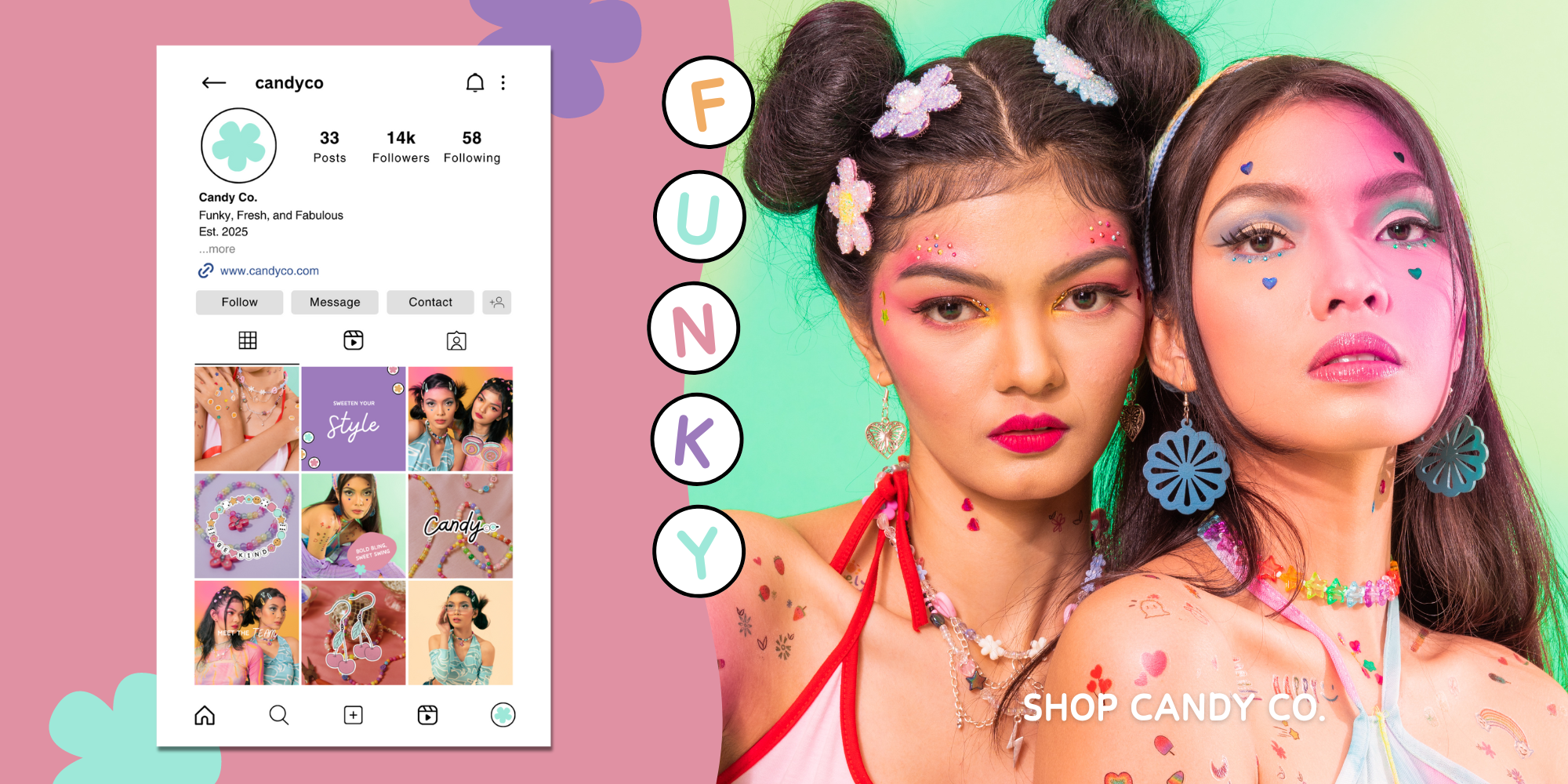
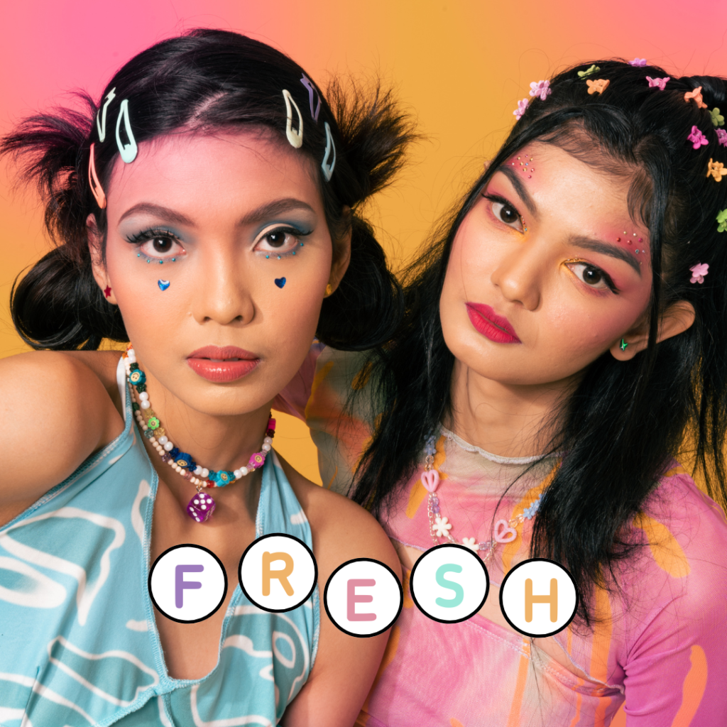
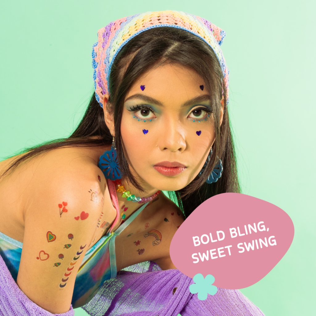
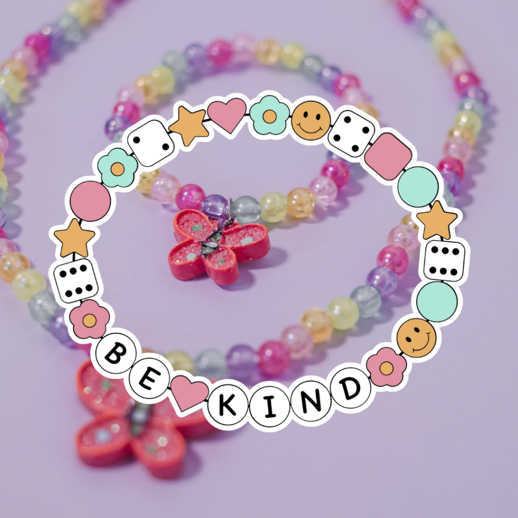
BRIEF Candy Co Jewellery is a vibrant, funky, and retro-inspired jewelry brand that combines bold colors, playful designs, and nostalgic elements to create standout pieces.
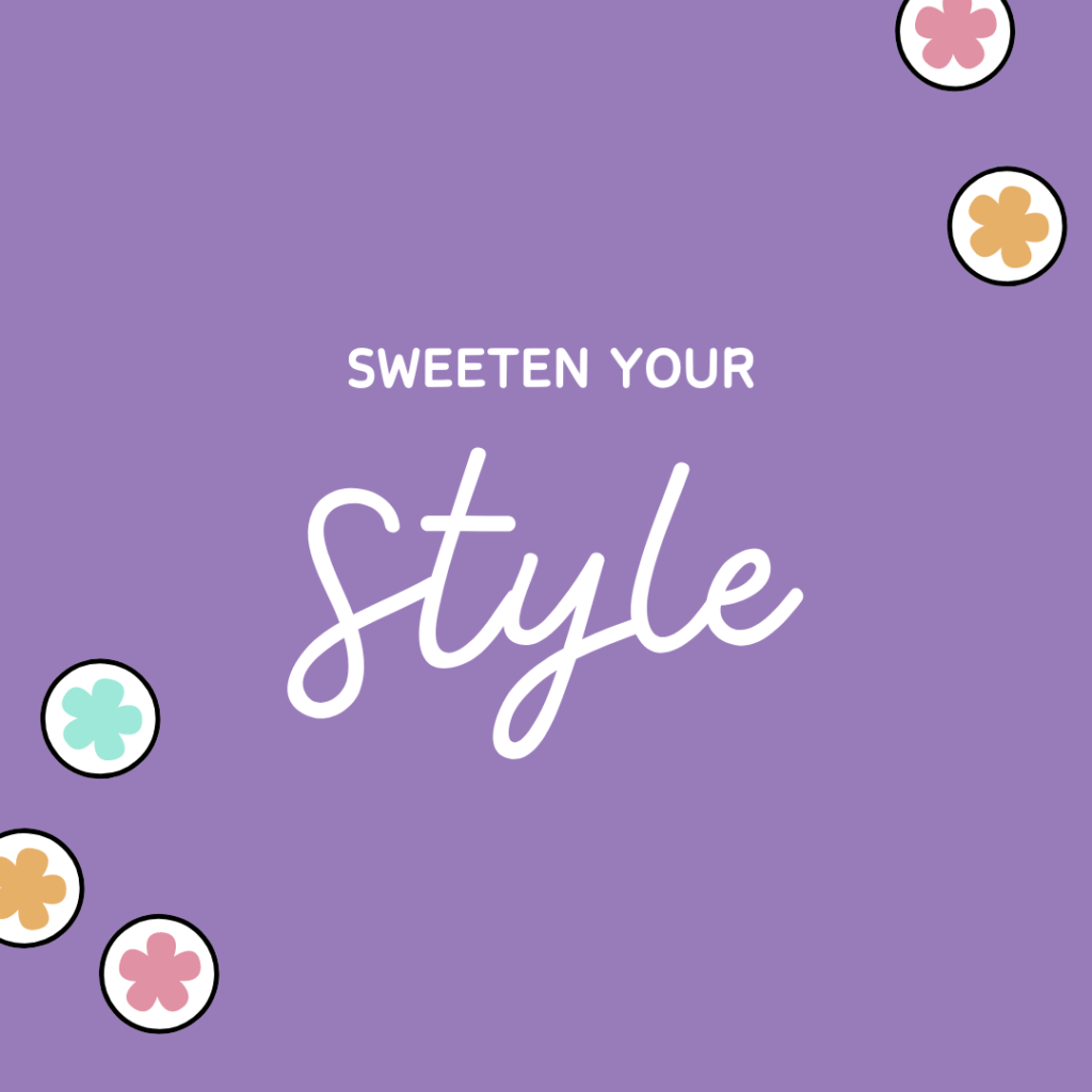
OBJECTIVES ✸ Develop a bold, colorful logo that embodies the funky and retro essence of the brand. ✸ Design social media content to showcase the fun, fabulous spirit of the jewelry, emphasizing vintage inspiration and statement pieces. ✸ Create visuals for digital campaigns that connect with fashion-forward, trend-loving customers.
LOGO DESIGN
✸ The flowing, cursive style of “Candy” adds a sense of fun, perfectly aligning with the brand’s funky, fabulous nature while giving it a personal, handcrafted feel.
✸ The “Co” inside circular charms with the colored accent (pink “C” and teal flower-like symbol) brings in a subtle retro vibe, adding visual interest without overpowering the main text.
✸ The mix of pastel pink and teal with black strikes a balance between femininity and boldness, reflecting the brand’s playful and bold character.
✸ The pastel hues add a candy-like feel, reinforcing the name and personality of the brand.